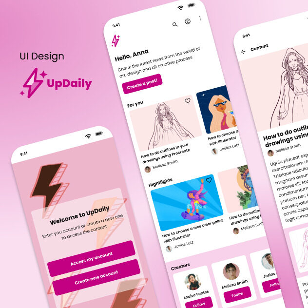
Happy to be able to share this project that emerged from Figma studies, and aims to contemplate some of the principles that involve design of digital interfaces. Elementary concepts such as sitemap and flows, lo-fi wireframes, alignments and grids, colors, typography, accessibility, icons, atomic design, components, variants, hi-fi wireframes and prototyping. It is a smartphone application which people can view and also share techniques, studies and content related to any creative area. The main objective of the application is to be able to foster a community of knowledge sharing among creatives, so that they can always keep up to date
This project is a conceptual study, feel free to give any feedback you consider that may help my development as a designer! 🙂
Explored steps in this project:
Project overview
Flow diagram
Sketches
Lo-fi wireframes
Alignment and grid
Colors
Accessibility
Typography
Icons
Atomic design
Components and variants
Hi-fi UI
Prototype
The flow diagram:
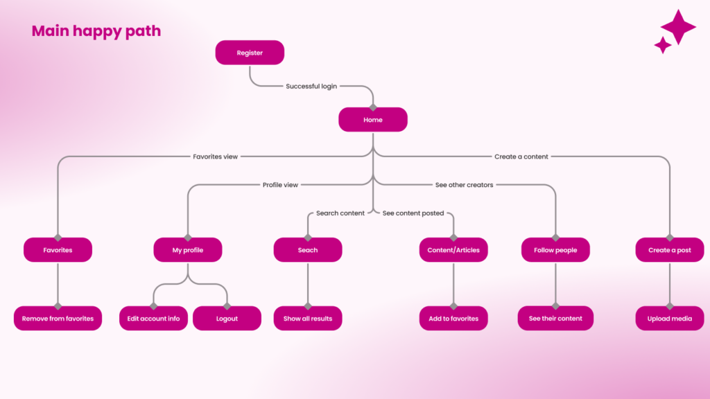
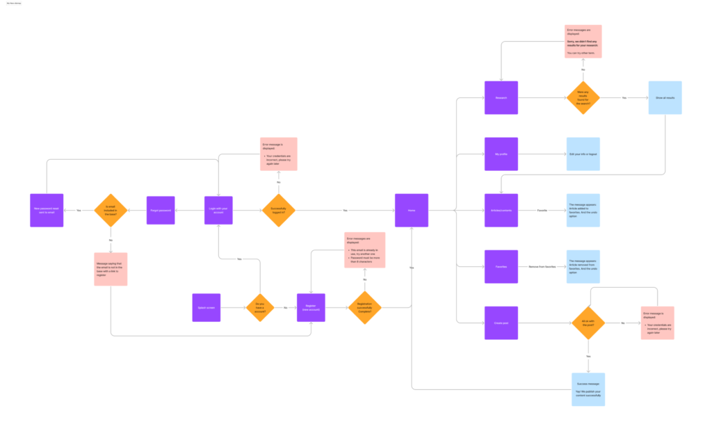
To understand all the needs and functionalities that the user needs to use the application, I created the sitemap below with the main flow. From it I was also able to generate maps with error flows. Here I share both maps generated, the complete one that guided the project since de begining with errors and the happy one (without errors).
Sketches & Lo-fi wireframes:
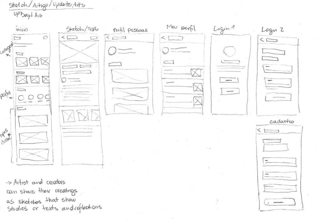
From the understanding of the sitemap and the user flows in the application, I went to ideas of how the interfaces could be organized visually, through low fidelity wireframes, using paper and pen and, later, using shapes in figma.
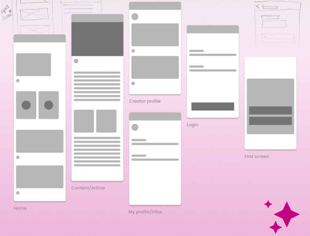
After setting the initial ideas of the product and defining the screens that I would create I went to the visual characteristics definitions:
Typography & Icons:
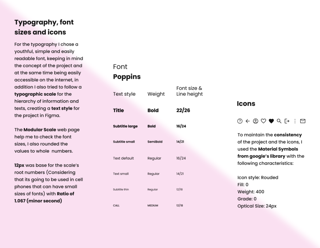
For the typography I chose a youthful, simple and easily readable font, keeping in mind the concept of the project and at the same time being easily accessible on the internet, in addition I also tried to follow a typographic scale for the hierarchy of information and texts, creating a text style for the project in Figma.
The Modular Scale web page help me to check the font sizes, I also rounded the values to whole numbers. 12px was base for the scale’s root numbers (Considering that its going to be used in cell phones that can have small sizes of fonts) with Ratio of 1.067 (minor second).
Icons:
To maintain the consistency of the project and the icons, I used the Material Symbols from google’s library with the following characteristics:
Icon style: Rouded
Fill: 0
Weight: 400
Grade: 0
Optical Size: 24px
Colors:
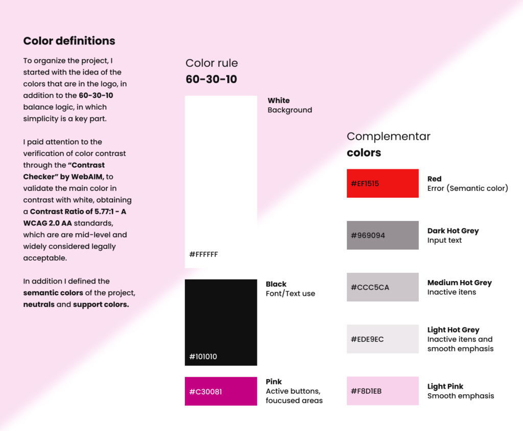
To organize the project, I started with the idea of the colors that are in the logo, in addition to the 60-30-10 balance logic, in which simplicity is a key part.
I paid attention to the verification of color contrast through the “Contrast Checker” by WebAIM, to validate the main color in contrast with white, obtaining a Contrast Ratio of 5.77:1 – A WCAG 2.0 AA standards, which are are mid-level and widely considered legally acceptable. In addition I defined the semantic colors of the project, neutrals and support colors.
Alignment and grid:
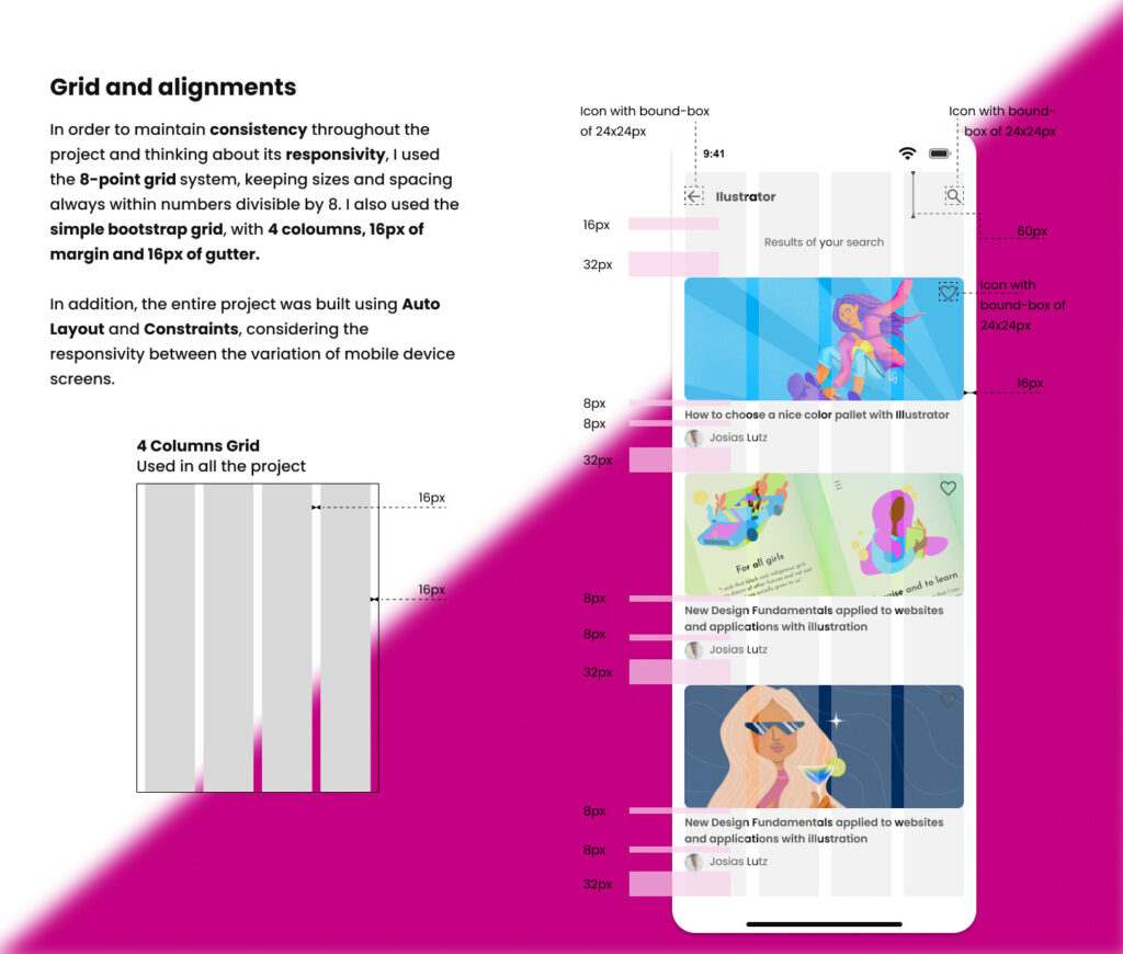
In order to maintain consistency throughout the project and thinking about its responsivity, I used the 8-point grid system, keeping sizes and spacing always within numbers divisible by 8. I also used the simple bootstrap grid, with 4 coloumns, 16px of margin and 16px of gutter. As reference I used material design from Google “Responsive layout grid”.
In addition, the entire project was built using Auto Layout and Constraints, considering the responsivity between the variation of mobile device screens.
Atomic design:
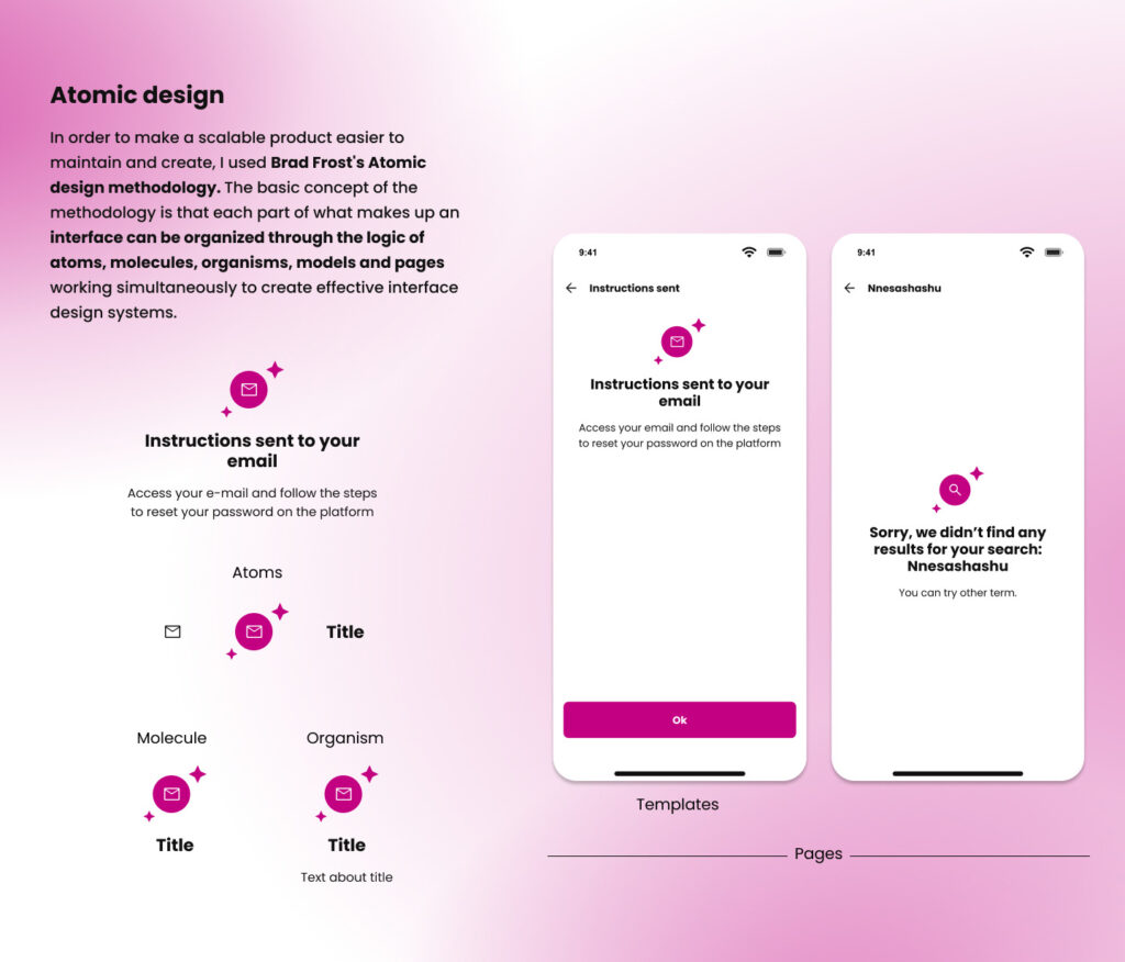
In order to make a scalable product easier to maintain and create, I used Brad Frost’s Atomic design methodology. The basic concept of the methodology is that each part of what makes up an interface can be organized through the logic of atoms, molecules, organisms, models and pages working simultaneously to create effective interface design systems.
Components and variants:
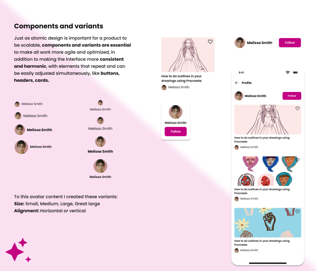
Just as atomic design is important for a product to be scalable, components and variants are essential to make all work more agile and optimized, in addition to making the interface more consistent and harmonic, with elements that repeat and can be easily adjusted simultaneously, like buttons, headers, cards.
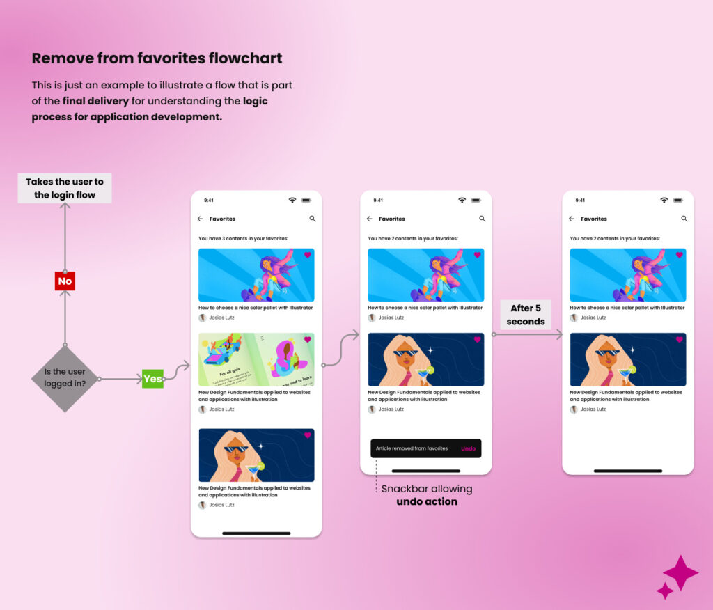
Delivery examples (flowchart):
This is just an example to illustrate a flow that is part of the final delivery for understanding the logic process for application development.
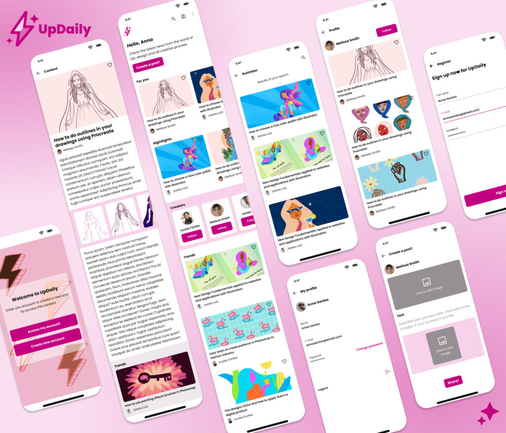
Hi-Fi prototypes:
Prototype:
Check the final prototype here!
For now thats all. Still, there are hundreds of path possible after doing a project like that as a MVP, as a 1 version, but anyway, I am happy to be able to do it so far. (:
Please, if you have any feedback or advice, feel free to do it!
PS.: All images of illustrations in the project are from my previous artwork!
